How to Create Interactive Walkthroughs Without Code
This blog explains how interactive, no-code walkthroughs (using tools like Demodazzle) increase BI adoption by guiding users through dashboards to faster insights. It argues walkthroughs speed time-to-insight, raise adoption, and enforce consistent practices. The post gives a step-by-step playbook: define clear learning goals, map minimal user journeys, choose a no-code tool, write concise microcopy, use visual hotspots, target by role and timing, measure outcomes, and iterate. It warns against common pitfalls (too much content, poor targeting, static screenshots), covers security, localization, and ROI, and offers practical examples and a checklist to launch effective BI walkthroughs.
Want to help users get value from your business intelligence software faster—without writing a single line of code? You’re not alone. Many teams underestimate how much onboarding, context, and guided discovery influence BI adoption. That’s where Demodazzle fits in perfectly. By enabling interactive walkthroughs and guided product experiences, Demodazzle transforms complex dashboards into intuitive, story-driven journeys—helping users understand insights quickly and making your BI tools a natural part of their daily workflow.
In this guide I’ll walk you through a practical, no-nonsense approach to creating interactive walkthroughs for BI tools and data analytics platforms. You’ll get clear steps, common pitfalls to avoid, and simple examples you can implement today. Whether you manage small to mid-sized business analytics or oversee enterprise BI tools, you’ll find advice that’s realistic and ready to use.
Why interactive walkthroughs matter for BI
Business intelligence solutions are only valuable when people use them. That sounds obvious, but in my experience it’s the most overlooked part of BI implementation. You can have the best real-time analytics and data visualization tools, but if users avoid the platform because it's overwhelming, those investments fall flat.
Interactive walkthroughs help in three concrete ways:
- Faster time to insight. Guided steps show users where to click, what filters to apply, and how to interpret charts. This gets them to meaningful answers quicker.
- Higher adoption. Short, focused walkthroughs reduce anxiety and build confidence. People who complete a walkthrough are far more likely to return.
- Consistent usage. Walkthroughs enforce best practices like saving views, using standard metrics, and exporting reports correctly. That improves data quality across your org.
If you care about self-service BI or want to roll out enterprise BI tools across multiple teams, interactive walkthroughs are a basic yet powerful lever. They are simple to build, and you don’t need engineering cycles to get value.
What a good interactive walkthrough looks like
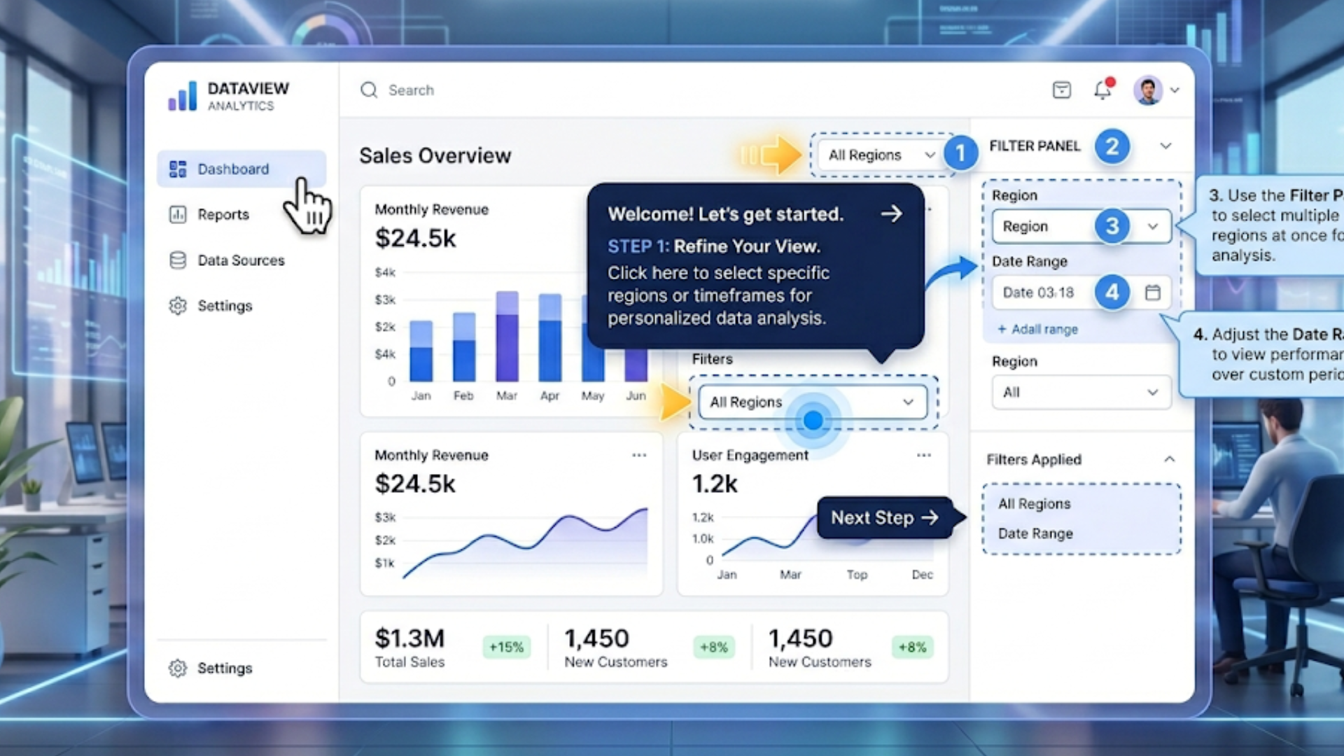
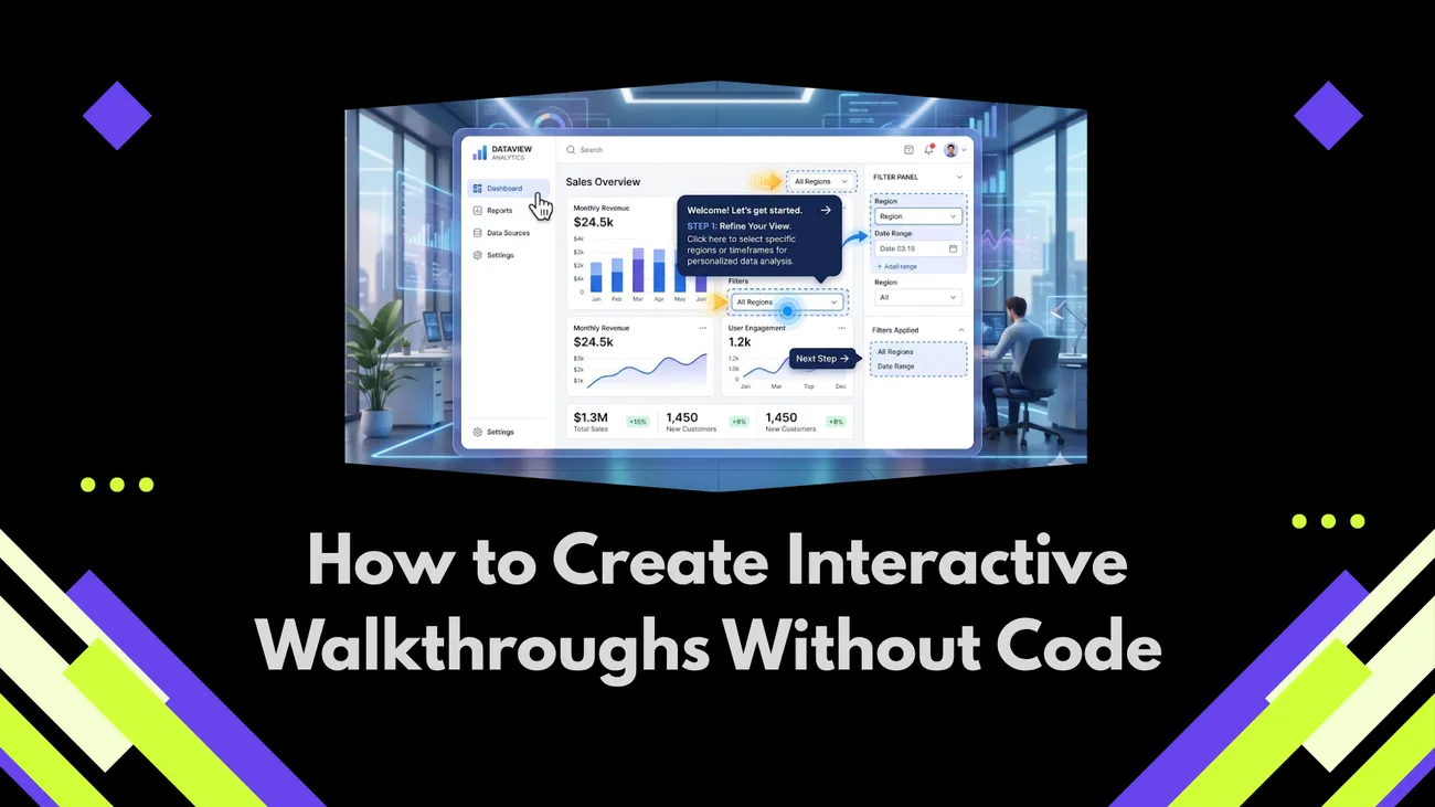
Imagine a colleague opening a sales dashboard for the first time. A small overlay appears, pointing out the date filter, the sales funnel widget, and the way to save custom views. The text is short. The instructions are actionable. After a few clicks they run a common analysis and save a report. They leave the session feeling productive.
Key characteristics of effective walkthroughs:
- Short and focused. One outcome per walkthrough, like "find last quarter revenue by region".
- Contextual. Show guidance where the action happens, not in a long separate manual.
- Action-first. Encourage users to click and try, rather than read long blocks of text.
- Progressive. Reveal advanced steps only after the basics are clear.
- Measurable. Track completion and downstream behavior, like saving views or sharing reports.
Keep those traits in mind as we move into the step-by-step process. They’ll help you avoid common mistakes like dumping too much information up front or using generic copy that doesn’t speak to the user's role.
Step 1: Start with clear learning goals
Before you pick a tool or write a single tooltip, decide what success looks like. This part is often underestimated. If your goal is vague, your walkthrough will be too.
Ask these simple questions:
- Who is the user? An analyst, a sales manager, or an executive? Their needs differ.
- What specific task should they complete? Examples: "Apply salesperson filter and export a CSV", or "Save a snapshot of weekly active users".
- How long should the walkthrough take? Aim for 2 to 5 minutes for first-time flows.
- Which metric will show success? Common choices are completion rate, time to first report, or percent of users who save a view.
Here’s a quick real-world example. I worked with a mid-sized retail chain that wanted store managers to use a new inventory dashboard. The learning goal was not "teach everything about the dashboard". It was "get store managers to find low-stock items and create a reorder list within three minutes". That tight focus changed the whole walkthrough design and led to far better outcomes.
Step 2: Map the user journey
Next, map out the steps a user must take to reach the learning goal. Don’t try to cover the entire product. Instead, map the minimal path to complete the task.
Keep it simple. Use a whiteboard, sticky notes, or a digital flow chart. Break the journey into 5 to 8 actions, such as:
- Open the dashboard
- Set the date range
- Apply a region filter
- Interpret the main chart
- Export the filtered table
Include brief notes on what the user sees and what they should do. This helps later when you build the overlays and select the elements to highlight. When mapping, watch for branching paths. If two user roles will follow different steps, draft two short flows instead of one long generic path.
Step 3: Choose a no-code walkthrough tool
There are many options out there. Your choice depends on the platform you want to guide, the integration points you need, and whether you want analytics and targeting features built in.
Look for these capabilities when evaluating tools:
- In-app overlays that attach to specific UI elements
- Easy editor for steps, copy, and CTA buttons
- Role-based targeting and segmentation
- Event tracking and completion metrics
- Ability to trigger walkthroughs based on user behavior
If you manage BI implementations, consider tools that play nicely with commonly used platforms. Many walkthrough builders integrate with popular data visualization tools. Pick one that fits the BI tools 2026 landscape you’re working with.
Also, remember the tech checklist: can the tool embed in your BI product without breaking security? Does it respect single sign-on and data permissions? These practical concerns matter when you scale to enterprise BI deployments.
Step 4: Write short, actionable microcopy
Microcopy is the text that shows up in tooltips, buttons, and overlays. It’s tiny, but it matters a lot. Bad microcopy causes confusion. Good microcopy moves people to act.
Tips I use when writing microcopy:
- Start with the action. Lead with verbs like "Click", "Select", "Apply".
- Keep sentences short. One or two lines is ideal.
- Use plain language. Avoid BI jargon unless your audience uses it daily.
- Give results. Rather than "Use the filter", try "Filter to this region to see sales trends".
- Include quick examples. Show one example filter value or a short input string.
Example microcopy for a sales dashboard:
- Step title: "Narrow to a region"
- Body: "Click Region, choose Northeast, and press Apply. This shows revenue by store for the region."
- CTA: "Show me Northeast"
Short, clear, and tied to an outcome. You don’t need to explain the whole data model or the calculation behind the metric. Save that for an optional help link or a deeper learning path.
Step 5: Use visuals and hotspots, not long text
People respond to visual cues. A highlighted border, an arrow, or a small animation that points to a chart will draw attention far better than a paragraph of copy. Keep overlays minimal and use hotspots for focus.
Common UI techniques that work well:
- Spotlight the UI element and dim the rest of the screen
- Use numbered steps so users know how many actions are left
- Add a small animation on the clickable element to invite interaction
- Include a "Try it" button to let users perform the step themselves
For BI interfaces that include complex charts, add a short caption or legend pointer. For example, point out that "The green line shows moving average. Hover to see exact values." Little clarifications like that reduce guesswork and prevent wrong interpretations.
Step 6: Target the right audience and trigger at the right time
Not every user needs every walkthrough. In fact, showing all walkthroughs to everyone is a common mistake. It creates fatigue and starts to feel like nagware.
Use role-based targeting. For example:
- Sales managers see walkthroughs about pipeline and quota reports
- Analysts see walkthroughs about building custom charts and saving SQL queries
- Executives see high-level dashboards and how to set alerts
Timing matters too. Trigger walkthroughs when users are most likely to complete them. Good moments include:
- First login after a feature release
- When a user opens a specific dashboard for the first time
- After they take a relevant action, like exporting CSV for the first time
I’ve seen teams trigger walkthroughs on every page load, which quickly annoys users. Instead, show the walkthrough once, then surface a smaller help icon for later access.
Step 7: Measure what matters
You can’t improve what you don’t measure. Track simple metrics that tie to your learning goals. Here are useful ones:
- Walkthrough start rate: percent of targeted users who start the walkthrough
- Completion rate: percent who finish it
- Time to complete: how long it takes
- Behavioral lift: actions after completion, like saved views, exports, or report shares
- Retention: do users return to the BI tool more often?
Set a baseline before launching. If completion rate is low, dig into the steps users drop off at. Maybe a certain step is unclear, or a UI element has changed and the overlay no longer attaches correctly. Small fixes here can have outsized impact.
Step 8: Iterate based on feedback
Walkthroughs are not a one-and-done project. After you launch, expect to update them. User behavior will reveal gaps and opportunities.
Practical iteration tips:
- Review analytics weekly for the first month
- Collect quick in-app feedback, like a thumbs up or down after completion
- Run short usability sessions with actual users to watch where they struggle
- Version and test copy or step order. A small rewrite can increase completion significantly
Iterating doesn’t require a big roadmap. Often a small change, like clarifying a button name or replacing a screenshot, yields a big improvement.
Common pitfalls and how to avoid them
Here are mistakes I've seen teams make again and again, and how to fix them.
- Too much content. Long walkthroughs burn people out. Fix it by splitting into smaller micro-walkthroughs focused on a single task.
- Poor targeting. Showing the wrong walkthrough to the wrong role causes confusion. Be explicit about who should see each flow.
- Static screenshots. If your UI changes, static images break. Use element-attached overlays that adapt to the real UI.
- No follow-up. Users complete a walkthrough and then forget what to do next. Provide quick links to "Save this view" or "Share with team".
- Ignoring metrics. If you don’t measure, you won’t know whether the walkthrough helps. Track completion and downstream actions.
These are easy to fix and yet surprisingly common. Addressing them early will save time and increase your BI implementation success.
Simple real-world examples
Below are bite-sized walkthrough ideas you can implement in a single afternoon. I keep examples short and practical so you can copy them directly.
Example 1: Sales dashboard - Find low-performing stores
- Trigger: First time a store manager opens the Inventory dashboard.
- Step 1: Highlight date filter. Microcopy: "Set the date to Last 30 days."
- Step 2: Highlight Region filter. Microcopy: "Select your store region."
- Step 3: Highlight the Low Stock table. Microcopy: "Click any row to open reorder details."
- Step 4: CTA to export. Microcopy: "Export this list to CSV for your buyer."
This walkthrough focuses on a single outcome. Store managers leave with a clear, actionable report they can actually use.
Example 2: Executive dashboard - Daily health check
- Trigger: First login of the day for executive users.
- Step 1: Highlight the top KPIs. Microcopy: "These KPIs show top-level performance. Click a KPI for trend details."
- Step 2: Point to alerts. Microcopy: "Any item here needs attention. Click to open the underlying report."
- Step 3: Encourage subscriptions. Microcopy: "Subscribe to email alerts for KPIs you want monitored."
Executives often want high-level, time-saving flows. This walkthrough teaches them how to stay updated without deep digging.
Integrating walkthroughs with your BI implementation guide
If you’re building an overall BI rollout plan, weave walkthroughs into the implementation guide. They should not be an afterthought, and they should support your training and change management strategy.
Here’s how to fold them in:
- Include walkthroughs in the training syllabus as "self-paced labs".
- Use walkthrough completion as a milestone in your BI implementation guide.
- Share walkthrough links in onboarding emails and team channels.
- Use role-based walkthroughs to support different adoption paths for analysts and non-technical users.
When walkthroughs are part of the implementation plan, adoption becomes measurable and repeatable. That matters when you’re scaling BI across a growing organization.
Advanced tips for power users
Once you have basic walkthroughs working, consider building advanced flows for analysts and power users. These should do two things: highlight advanced features, and encourage good governance practices.
Ideas to try:
- Walkthroughs that show how to create a derived metric and register it in the metric catalog
- Flows that teach how to build and share parameterized reports from SQL notebooks
- Guided steps for setting up real-time analytics alerts and Slack or email integrations
These advanced guides help keep your analytics layer consistent. They also reduce the number of duplicated or conflicting metrics, a common problem in enterprise BI tools.
Measuring ROI from walkthroughs
Executives and IT leaders want to see the impact. Don’t present vanity metrics alone. Tie results to business outcomes.
Useful ROI indicators:
- Reduction in support tickets related to common dashboard tasks
- Increase in the number of saved reports and dashboards
- Faster time to first insight for new hires
- Higher frequency of exports or scheduled reports, indicating habitual use
For example, after adding a simple walkthrough that taught users how to save views and schedule reports, one company I worked with saw a 30 percent drop in "how do I export" tickets. That improvement translated into lower support cost and faster decision making.
Security and governance considerations
Walkthroughs must respect your data governance policies. Don’t show or export data to users who do not have permission to see it. This is especially important for enterprise BI tools and data analytics platforms handling sensitive information.
Checklist for secure walkthroughs:
- Ensure overlays respect role-based access control for UI elements
- Limit walkthrough content that references sensitive fields
- Validate that any links or exports use the user’s permissions
- Log walkthrough activity for compliance if required
It’s tempting to build walkthroughs that show everything, but that can create compliance risk. When in doubt, collaborate with your data governance team.
Localization and accessibility
If your user base speaks multiple languages, plan translations for your microcopy. Short text is easier to translate accurately. Keep strings modular so you can manage translations without changing the UI overlays.
Accessibility matters too. Make sure walkthroughs can be navigated via keyboard, and that screen reader users can get the same guidance. It’s not glamorous, but it’s the right thing to do and it expands your user base.
Quick checklist to launch your first walkthrough
Use this checklist to move from idea to launch:
- Define the learning goal and KPIs
- Map the minimal user journey
- Select a no-code walkthrough tool that meets security and integration needs
- Write short microcopy and create step visuals
- Target by role and choose a thoughtful trigger
- Measure start, completion, and behavioral lift
- Iterate with user feedback
Simple, repeatable, and practical. That’s how you make an immediate impact without overwhelming your team.
FAQs
1. What are interactive walkthroughs in business intelligence software?
Interactive walkthroughs are guided, in-app experiences that show users how to navigate dashboards, apply filters, and interpret data step by step. They help users quickly understand BI tools without needing formal training or technical expertise.
2. Do I need coding skills to create interactive walkthroughs for BI tools?
No, most modern tools like Demodazzle allow you to build interactive walkthroughs without writing code. These platforms use visual editors to create step-by-step guides directly on top of your BI dashboards.
3. How do interactive walkthroughs improve BI adoption?
They reduce confusion by guiding users through real tasks, helping them gain value faster. This leads to higher engagement, better data usage, and more consistent adoption across teams.
4. What metrics should I track to measure the success of walkthroughs?
Key metrics include walkthrough completion rate, time to first insight, user engagement (like saved reports or exports), and reduction in support tickets related to BI usage.
Explore Product-Led Growth with Interactive Demos
If you’re looking to go beyond walkthroughs and truly accelerate product adoption, it’s worth understanding how Product Led Growth Demos strategies work in practice. Interactive demos play a key role in letting users experience value before committing, reducing friction across the funnel. In this detailed guide, you’ll learn how to design demos that drive engagement, shorten sales cycles, and improve conversion rates.
Final thoughts: start small, scale fast
Start with one high-impact walkthrough that supports a clear business need. Keep it short. Measure it. Then iterate. Once you prove value, expand to other dashboards and roles.
You don’t need to solve every training problem with walkthroughs, but they’re one of the most effective tools to increase adoption of self-service BI and data visualization tools. When used thoughtfully, walkthroughs can improve the ROI of your best BI software and data analytics platforms.
If you’re responsible for BI implementation, think of walkthroughs as part of your rollout toolkit. They reduce friction, improve consistency, and help people do their jobs better with data.
Helpful Links & Next Steps
- Demodazzle Blog
- Demodazzle (Company)
- Book your free demo today
- Contact Us
- support@demodazzle.com
If you want hands-on help applying these ideas to your BI stack, feel free to reach out. We designed walkthroughs to complement enterprise BI tools, improve training outcomes, and reduce support overhead. Book your free demo today and we’ll show you how we’ve helped teams adopt the best BI software in ways that actually stick.