How Demo Walkthrough Software Transforms Product Onboarding
Onboarding can make or break a SaaS product. You can have the most elegant UI, the best pricing, and a killer roadmap—but if users don’t understand value quickly, churn climbs and growth stalls. That’s where demo walkthrough software comes in. In my experience, guided walkthroughs and interactive product demos are the short path from confusion to "aha." They turn trial users into power users, and prospects into sales-ready conversations.
Why product-led onboarding matters right now
Product-led growth isn't a fad—it's a shift in how software gets adopted. Users expect to self-serve: to discover features, try flows, and understand ROI without waiting for a salesperson. For startups and established companies alike, that expectation translates to a simple requirement: deliver value fast.
I've noticed two things over and over. First, users who reach that first meaningful outcome in their first session are far more likely to convert. Second, companies that invest in interactive product demo experiences reduce support tickets and increase expansion revenue. Demo walkthrough software sits at the intersection of those outcomes.
What is demo walkthrough software?
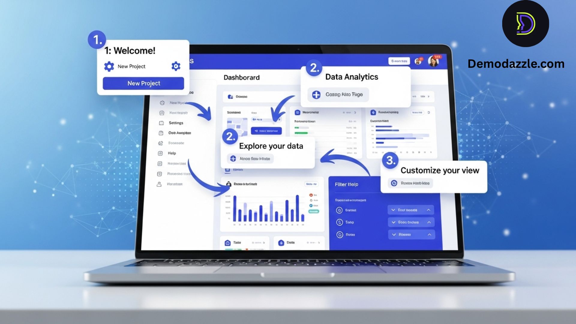
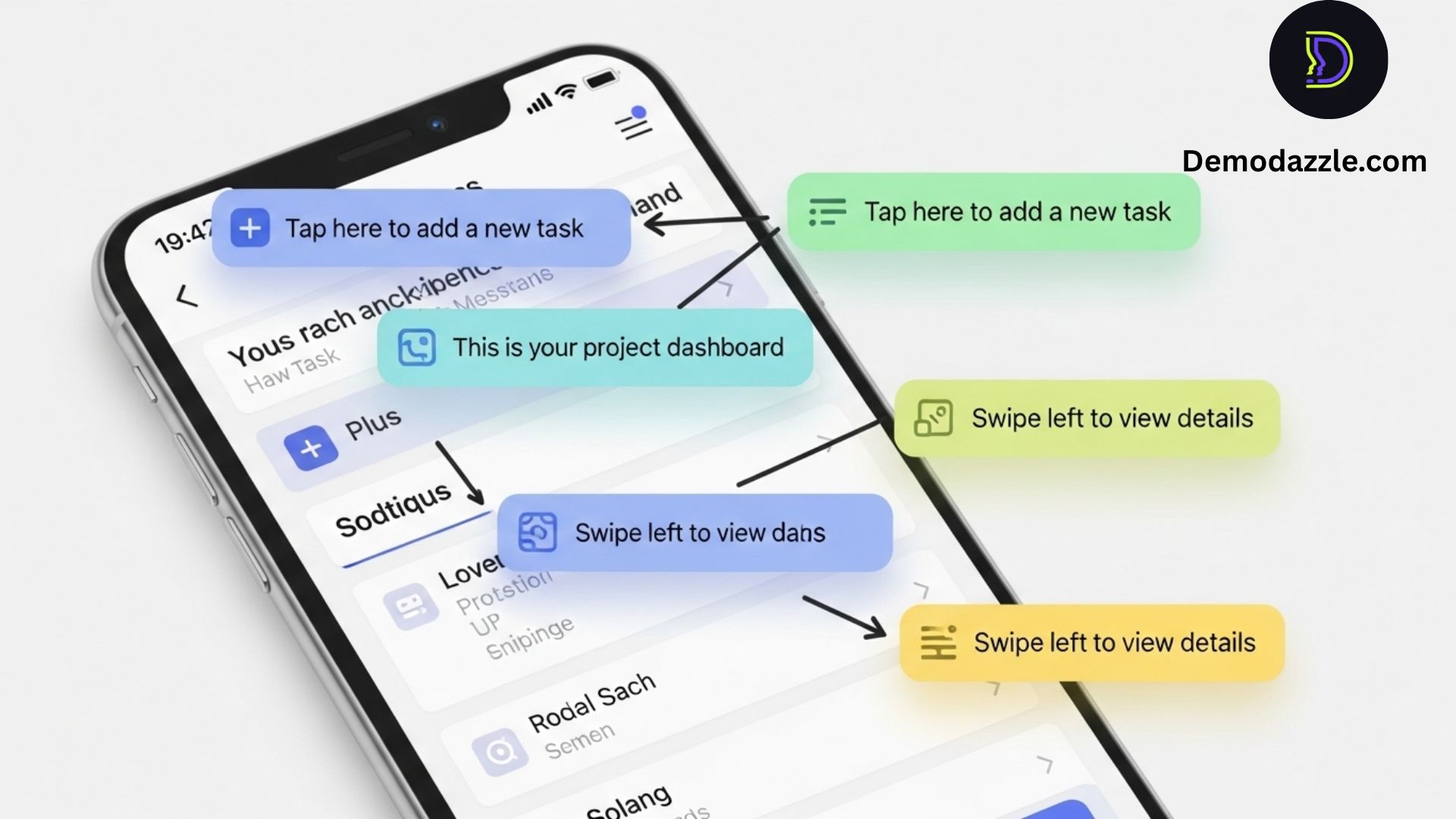
At its core, demo walkthrough software lets you build guided, interactive tours of your product. Think step-by-step overlays, tooltips, hotspots, and in-app prompts that guide people through real tasks—without a human on the other end. Unlike static product videos, interactive product demos let users try features in context, which is crucial for getting them to adopt the product.
Some of the common names you'll hear: guided walkthroughs, in-app guidance, product onboarding software, and customer onboarding software. The technology varies, but the goal is the same—help users reach value faster.
Key benefits for SaaS teams
Demo walkthrough software delivers benefits across the funnel. Whether you’re a product manager, customer success lead, sales enablement pro, startup founder, or product marketer, there’s something here:
- Accelerated time-to-value: Guided walkthroughs show users the critical workflows that lead to "aha" moments.
- Higher trial-to-paid conversion: Interactive product demos keep users engaged during trials and help them discover premium features.
- Lower support load: Fewer how-to tickets when users can self-serve with in-app guidance.
- Better product-qualified leads: Demo usage data helps sales identify engaged prospects.
- Consistent onboarding experience: Everyone sees the same guided flow, reducing variance between customer success reps.
- Faster feature adoption: New features get traction faster when users are shown how to use them in context.
At DemoDazzle, we've seen trial conversions increase by double digits when teams combine a strong value-led signup flow with guided walkthroughs. That’s not magic—it's design plus data.
How interactive product demos beat static tutorials
People learn by doing. A 3-minute video that shows a feature isn’t the same as an interactive walkthrough that asks the user to click, configure, and see results. Interactive demos reduce cognitive load: the tool points at what matters, and the user follows a clear path.
Here’s a quick comparison I use when advising teams:
- Static videos: Great for storytelling, poor at personalization. Viewers passively consume content.
- Knowledge base articles: Useful for reference but often buried and hard to contextualize.
- Interactive product demos: Contextual, step-by-step, and measurable. They guide users during real workflows.
One common mistake I see: teams rely too heavily on docs and videos and expect users to bridge the gap. That rarely works. Demo walkthrough software acts as that bridge.
Where demo walkthrough software fits in the user journey
Think of onboarding as a series of checkpoints from awareness to retention. Interactive product demo tools help at several stages:
- Pre-signup / Marketing: Embedded interactive demos on landing pages convert visitors who want to try before they sign up.
- Signup flow: Inline guidance during account setup reduces drop-offs and increases activation.
- First 30 days: Contextual walkthroughs highlight core value paths and advanced capabilities when users are ready.
- Feature launches: Targeted walkthroughs introduce new features to relevant cohorts to boost adoption.
- Sales and enablement: Product demos used by sales to showcase workflows and by enablement to train reps consistently.
When you align walkthroughs with each stage, you create a cohesive, product-led onboarding strategy that scales.
Real-world examples and measurable outcomes
Let me share a few concrete examples we've seen work—some at DemoDazzle and some from customers I've advised.
- Example: Self-serve CRM startup — They added an initial 5-step interactive demo that guided users through creating their first pipeline and importing contacts. Result: 35% higher activation rate within 48 hours and a 20% reduction in first-week help tickets.
- Example: Analytics platform — Instead of one long tour, they created role-based walkthroughs (analyst, manager, admin). Result: admins adopted configuration features faster, leading to higher retention for large accounts.
- Example: Sales enablement — Sales reps used a shareable interactive demo rather than a screen-share to warm up prospects. Result: demo requests increased, and reps entered calls with better-qualified leads.
Those numbers aren’t hypothetical. They come from tweaking tour length, personalizing content, and instrumenting demos with analytics. The magic is in the details.
Designing effective guided walkthroughs: best practices
A walkthrough is only as good as the design behind it. Here are practical principles I use when building tours:
- Start with the outcome: Define the "aha" moment you want the user to reach. Build the walkthrough around that outcome—not around features.
- Keep it short: Break complex flows into small, task-focused steps. Users are more likely to complete a 3-step guide than an 18-step marathon.
- Context is king: Trigger walkthroughs where the user is—on the relevant page or after a to-do. Don’t guide people to parts of the UI they can’t access yet.
- Personalize: Use role, plan, or usage data to show the right walkthrough. A feature-heavy tour for a free user is wasted effort.
- Use progressive disclosure: Reveal complexity only when the user needs it. Start with the minimum viable action and offer deeper help on demand.
- Offer opt-out and replay: Users hate forced tours. Provide an easy way to skip or relaunch the walkthrough later.
- Measure everything: Track completion rates, drop-off steps, and downstream outcomes like feature use and retention.
Small details matter: clear button labels, friendly microcopy, and a predictable progression. I once saw a tour fail because the buttons said "Next" and "Proceed" inconsistently—little friction adds up.
Personalization and segmentation: the secret sauce
Not all users need the same tour. In my experience, adding just two segmentation layers—role and intent—dramatically increases engagement.
- Role-based walkthroughs: Show admins how to configure integrations, show end-users how to complete core tasks.
- Intent-based triggers: Use the user's signup source, inbound query, or features they've clicked to pick the right demo.
For example, a product marketer signing up from a campaign about "campaign analytics" should see a demo focused on campaign reporting, not on account administration. That alignment feels thoughtful and reduces time-to-value.
Common pitfalls to avoid
I've seen teams invest in walkthrough tech and then wonder why results lagged. Here are the frequent mistakes and how to fix them:
- An overly long first tour: Users drop off. Fix: aim for 3–5 meaningful steps in the first session.
- No measurement plan: You can't optimize what you don't measure. Fix: instrument the walkthrough with analytics and A/B test variations.
- Generic content for everyone: One-size-fits-all tours convert poorly. Fix: segment by role, plan, and intent.
- Using walkthroughs to hide product complexity: Guided tours can't replace bad UX. Fix: fix UX issues first, then layer walkthroughs to accelerate adoption.
- Forgetting handoffs: If a user hits an upgrade wall without clear next steps, you lose momentum. Fix: add upgrade CTAs and clear paths to request demos or talk to sales.
These are not theoretical pitfalls. They're practical lessons. Addressing them requires cross-functional work—product, CS, marketing, and sales need to collaborate.
Metrics to track for demo walkthrough success
When evaluating the impact of demo walkthrough software, track these metrics:
- Walkthrough completion rate: The percentage of users who finish a tour; low rates indicate friction or irrelevance.
- Activation rate: The share of users who reach the "aha" moment within a set timeframe.
- Trial-to-paid conversion: Whether guided users convert at higher rates.
- Feature adoption: Usage lift for the features promoted by the walkthrough.
- Support tickets: Ticket volume reduction for tasks covered by walkthroughs.
- Time to first value (TTFV): The average time it takes users to see value for the first time.
Track these metrics by cohort—by source, plan, and role. You’ll find that walkthroughs move the needle more for some cohorts than others, and that tells you where to invest next.
Integrating demo walkthroughs with sales and CS
Demo walkthrough software isn’t just a self-serve tool. It’s also a bridge between product-led growth and human-led sales. Here’s how to synchronize the teams.
- Sales qualification: Surface walkthrough engagement to CRM so reps know who’s using the product and how.
- Enablement content: Use shareable walkthrough links in sales sequences to pre-frame demos and focus conversations.
- Customer success playbooks: Trigger in-app guides for onboarding milestones and combine them with CS outreach.
- Hand off signals: Define clear thresholds (e.g., walkthrough completion + account size) to route users to sales.
In one project I worked on, integrating walkthrough signals into the CRM reduced discovery call times by 30%—reps knew exactly what the account had already done.
Scaling walkthrough programs
As your product grows, walkthrough programs need a simple governance model. Otherwise you end up with tours everywhere—duplicate content, inconsistent messages, and stale guides.
Here’s a lightweight framework that works:
- Ownership: Assign a content owner (product or onboarding specialist) for each walkthrough.
- Content library: Maintain a centralized catalog of tours with metadata: owner, audience, goal, last updated.
- Review cadence: Quarterly reviews to retire or refresh tours.
- Localization & accessibility: Prioritize languages and accessibility features for top markets.
- Experimentation pipeline: Reserve a slot for A/B tests each quarter to keep improving engagement.
Simple governance avoids chaos and ensures each walkthrough continues to deliver value.
Choosing the right demo walkthrough software
Not all demo walkthrough software is created equal. When evaluating tools, keep these capabilities top of mind:
- Low friction authoring: Can non-engineers build and edit tours easily?
- Segmentation and targeting: Does the tool support role and intent targeting?
- Analytics & funnel tracking: Can you measure completion, drop-off, and downstream outcomes?
- CRM and analytics integrations: Does it integrate with your stack (e.g., Salesforce, HubSpot, Segment)?
- Shareable demos: Can you generate linkable or embeddable interactive demos for sales and marketing?
- Performance and UX: Is it lightweight and accessible on mobile if needed?
At DemoDazzle, we focus on creating flexible, role-aware guided walkthroughs that are easy to author and instrument. The usual trade-offs are power vs. simplicity—pick a tool that matches your team’s resources and velocity.
How to run your first demo walkthrough pilot
Start small and measure. Here’s a piloting checklist that’s helped teams move fast:
- Pick a single use case: A critical "first value" task (e.g., create first report, set up billing).
- Define success metrics: Completion rate, activation lift, and trial-to-paid conversion.
- Build a 3–5 step walkthrough: Keep it focused and contextual.
- Segment your audience: Target new signups from a specific source or role.
- Run the pilot for 2–4 weeks: Collect data and qualitative feedback (in-app surveys, session recordings).
- Iterate: Improve copy, step placement, and targeting based on results.
During pilots, one thing that always surprises teams is how small copy tweaks—more actionable prompts, friendlier tone—can improve completion rates dramatically.
Using walkthroughs to increase demo requests and trials
Interactive product demos work in marketing and sales contexts, too. Instead of making visitors request access, offer a self-guided interactive demo on the landing page. That lowers friction and warms prospects for a human demo.
A couple of tactics that convert well:
- Gated interactive demo: Capture an email for full access; use partial demo content to entice signups.
- Shareable walkthroughs: Include a "Send to colleague" or "Book a live review" CTA inside the demo for prospects ready to talk.
- Contextual upgrade prompts: When a user reaches a premium feature in the demo, show a targeted CTA to request a trial or contact sales.
These approaches increase demo requests because they give prospects enough context to ask smarter questions. In practice, we see more qualified demo requests when prospects engage with an interactive demo first.
Content and copy tips that actually work
Copy in walkthroughs is microcopy heaven—small, high-impact spots to influence behavior. Here’s what I do:
- Use plain language: Avoid product-speak. Replace "leverage" with "use" and "solution" with "feature."
- Set expectations: Tell users how long the tour will take: "Quick 2-step setup."
- Be action-oriented: Use verbs in CTA buttons: "Create report" beats "Next."
- Humanize the tone: A little personality goes a long way. Short jokes or friendly asides make tours less robotic.
- Show benefit before features: "See engagement for last 30 days" vs. "Open analytics dashboard."
These are small edits but they impact completion and sentiment. I've watched completion rates rise by double digits after switching to benefit-first language.
Accessibility and inclusivity
Don't treat accessibility as an afterthought. A walkthrough can't help users who can't access it. Make sure your demo walkthrough software supports:
- Screen reader compatibility
- Keyboard navigation
- High-contrast modes and accessible colors
- Localization and translation for target markets
Small wins here not only expand your reach but also reduce legal and reputational risk. Accessibility improves usability for everyone—not just users with disabilities.
Advanced techniques: progressive onboarding and feature flags
As you mature, combine walkthroughs with feature flags and progressive onboarding strategies. Release new features behind flags, and roll out targeted walkthroughs to test impact.
Why this matters: it lets you validate feature-market fit and adoption before committing to a full rollout. You can A/B test different tours and measure not just completion but business outcomes like retention and revenue impact.
One trick that works well: use an experiment where 50% of eligible users see a targeted walkthrough and 50% don't. Compare activation, stickiness, and support tickets. Usually, the guided group performs better—if your walkthrough is well-designed.
How DemoDazzle approaches demo walkthroughs
At DemoDazzle, we build walkthroughs with an outcomes-first mindset. Our approach focuses on designing short, role-based guided tours that map to business events: conversion, activation, expansion, and retention. We pair tours with analytics so product teams can see not just who completed a guide, but how that completion affected their lifecycle.
We also advocate for cross-functional ownership. Product builds the flows, marketing aligns messaging, and customer success monitors downstream health metrics. It’s a team sport.
Also read:-
- Best Open Source LLMs You Can Run Locally in 2025
- Top Video Background Remover Apps in 2025 You Should Try
- 10 Best AI Thumbnail Maker Tools in 2025 to Boost Clicks & Views
Checklist: launching a demo walkthrough program
Use this checklist to get organized quickly:
- Define top 1–2 onboarding outcomes
- Identify target cohorts (role, source, plan)
- Create 3–5 step guided walkthroughs for each outcome
- Instrument analytics and tie to CRM
- Run a 2–4 week pilot
- Iterate based on metrics and qualitative feedback
- Scale with governance and review cadence
That sequence keeps teams focused and helps avoid "touritis"—the tendency to create tours for every possible scenario.
Helpful Links & Next Steps
- Book a quick demo: https://bit.ly/meeting-agami
- Try DemoDazzle: www.demodazzle.com
- Learn more on our blog: https://demodazzle.com/blog/
- Book a quick demo: https://bit.ly/meeting-agami
- Try DemoDazzle: www.demodazzle.com
- Learn more on our blog: https://demodazzle.com/blog/
Final thoughts: make your product do the selling
Companies that embed interactive product demos and guided walkthroughs into their onboarding convert and retain better. The product becomes the salesperson, the trainer, and the cheerleader. But remember: the technology is only half the battle. The other half is disciplined design, measurement, and teamwork.
In my experience, the biggest wins come when teams stop treating walkthroughs as an onboarding afterthought and begin to see them as a core channel in the go-to-market stack. Adopt the metrics, iterate quickly, and route signals to sales and customer success. Do that, and your product will do a lot of the heavy lifting.
FAQ: How Demo Walkthrough Software Transforms Product Onboarding
Q1. What is demo walkthrough software?
A1. Demo walkthrough software is a tool that guides users step by step through a product’s features and workflows. It helps businesses create interactive product demos and onboarding experiences without requiring complex coding.
Q2. How does demo walkthrough software improve product onboarding?
A2. It simplifies the onboarding process by providing guided, interactive tutorials instead of static documents or videos. This helps new users quickly understand how to use the product and reduces the time needed to become proficient.
Q3. What types of businesses can benefit from demo walkthrough software?
A3. SaaS companies, eCommerce platforms, fintech apps, HR tech, and any business offering digital products or platforms can benefit. Essentially, if your product requires user training, walkthrough software can make onboarding faster and smoother.
Q4. Does demo walkthrough software reduce support tickets?
A4. Yes. By guiding users in real-time and answering common "how-to" questions interactively, demo walkthroughs help reduce confusion, errors, and repetitive support queries.
Q5. How does it affect user engagement and retention?
A5. Engaged users who quickly understand a product are more likely to continue using it. Demo walkthrough software creates a positive first impression, leading to higher adoption rates and lower churn.
Q6. Can demo walkthrough software be customized for different user roles?
A6. Absolutely. Many platforms allow businesses to create role-specific walkthroughs so that users only see the most relevant features, which personalizes the onboarding experience.
Q7. Is demo walkthrough software difficult to set up?
A7. Most solutions are designed for ease of use with drag-and-drop editors. Businesses can create interactive demos without needing technical expertise or developer resources.